Petfood - an ingredient preview app for pet food delivery service
Petfood is an ingredients preview app for a pet food delivery service. This app shows the details of pet food ingredients and can help customers make better decisions by introducing ingredient filters. Displaying ingredients can also help customers understand what their allergic and picky pet really likes to eat.
My role
UX designer designing an app for pet food from conception to delivery.
Course
Google UX Design Professional Certificate (1-5), Coursera
Duration
Aug - Oct 2022
Project overview
The Problem:
Pet owners need to spend extra time checking the ingredients list because their pets are allergic to certain ingredients.
The Goal:
Design an app to display the main ingredients in an intuitive way and introduce the ingredient filter feature.
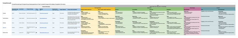
Competiitive audit
In order to have an overview of the competitors' strengths and weaknesses, a competitive audit was conducted before I start to design. And I identified the following opportunities in my own design:
-
Create a clear and concise display of ingredients
-
Offers customization options that emphasize allergenic ingredients and dietary alternatives
-
Integrate our app with voice assistive technology
-
Create a straightforward process for order, checkout, and delivery tracking
Understanding the user
Summary:
I conducted interviews and created empathy maps to understand the users I’m designing for and their needs. A primary user group identified through research was pet owners who find the ingredients list is hard to read.
This user group confirmed initial assumptions about pet food customers, but research also revealed that readability was not the only factor limiting users from reading ingredients efficiently. Other user problems included obligations, time, or challenges that make it difficult to get pet food for their picky pets.
Personas & User journey maps

Amy is a busy software engineer intern, who needs to buy cat food with specific ingredients, because her cat is fussy and it’s hard to find foods with specific ingredients that the cat likes to eat.

Mapping Amy’s user journey revealed how helpful it would be for users to have access to a petfood app with an ingredient filter.

Brian is a busy working interior designer, who needs to buy allergy-free pet food easily at home, because his pet is allergic to seafood and grains and reading the ingredient list is time consuming.
.png)
Mapping Brian’s user journey revealed how helpful it would be for users to have access to filter common allergy ingredients in the petfood app.
User pain points

Paper wireframes
Taking the time to draft iterations of each screen of the app on paper ensured that the elements that made it to digital wireframes would be well-suited to address user pain points. For the home screen, I prioritized a quick and easy ordering process to help users save time.


Digital wireframes
As the initial design phase continued, I made sure to base screen designs on feedback and findings from the user research.

Easy operation was a key user need to address in the designs in addition to equipping the app to work with assistive technologies.

Low-fidelity prototype
Using the completed set of digital wireframes, I created a low-fidelity prototype. The primary user flow I connected was ordering and purchasing a pet food, so the prototype was used in the first usability study.

Usability study: findings
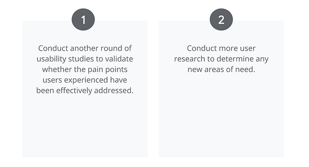
I conducted two rounds of usability studies. Findings from the first study helped guide the designs from wireframes to mockups. The second study used a high-fidelity prototype and revealed what aspects of the mockups needed refining.

Mid-fidelity prototype
After the first usability study's findings, I iterated the low-fidelity prototype to the mid-fidelity prototype, which shows the fundamental structure of the high-fidelity prototype.

Mockups
I conducted two rounds of usability studies. Findings from the first study helped guide the designs from wireframes to mockups. The second study used a high-fidelity prototype and revealed what aspects of the mockups needed refining.

Early designs allowed for some customization, but after the usability studies, I added additional options to preview the proportion of ingredients.
I also revised the design so users see all the tag of main ingredients when they first land on the screen.
The second usability study revealed the confusion of user seeing the ingredient filter the first time. To make the process more intuitive, I added a text hint to the filter.
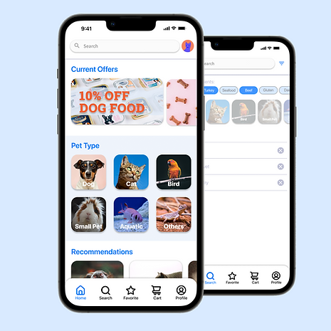
I also added the pet type category to this screen.


High-fidelity prototype
The final high-fidelity prototype presented cleaner user flows for ordering a pet food and checkout. It also met user needs for delivery service as well as more personalized filter.

Accessibility consideration

Takeaways
Impact:
The app makes users feel like this Petfood app really thinks about how to meet their needs.
One quote from peer feedback:
“The app made it so easy to order pet food for my picky dog! I would definitely use this app as a first choice when I need to buy pet foods.”
What I learned:
While designing the Petfood app, I learned that the first ideas for the app are only the beginning of the process. Usability studies and peer feedback influenced each iteration of the app’s designs.
Next step